
There is a reason some outfits make you look instantly rested, brighter, and more confident, while others seem to drain the life out of you even when the cut is perfect. Colour does more work than most people realise. It changes how your skin looks, how your eyes stand out, and how expensive your wardrobe feels.
Finding your best colours is not about putting yourself in a box or following rigid systems. It is about learning how colour interacts with your natural features so you can stop guessing and start choosing with confidence.
This guide will walk you through how to identify the colours that suit you best and how to use them to build a wardrobe that actually works.
Why Colour Matters More Than Fit Alone
A beautifully tailored jacket in the wrong colour will never look right. It might fit perfectly, but it will make you look dull, tired, or washed out. The right colour, on the other hand, can make even a basic tee look intentional.
Colour affects how your skin reflects light. Some shades bring warmth and clarity to your face. Others create shadows under your eyes or exaggerate redness. Once you see this difference, you cannot unsee it.
The Three Building Blocks of Colour
Instead of complex seasonal charts, think of colour in three simple qualities.
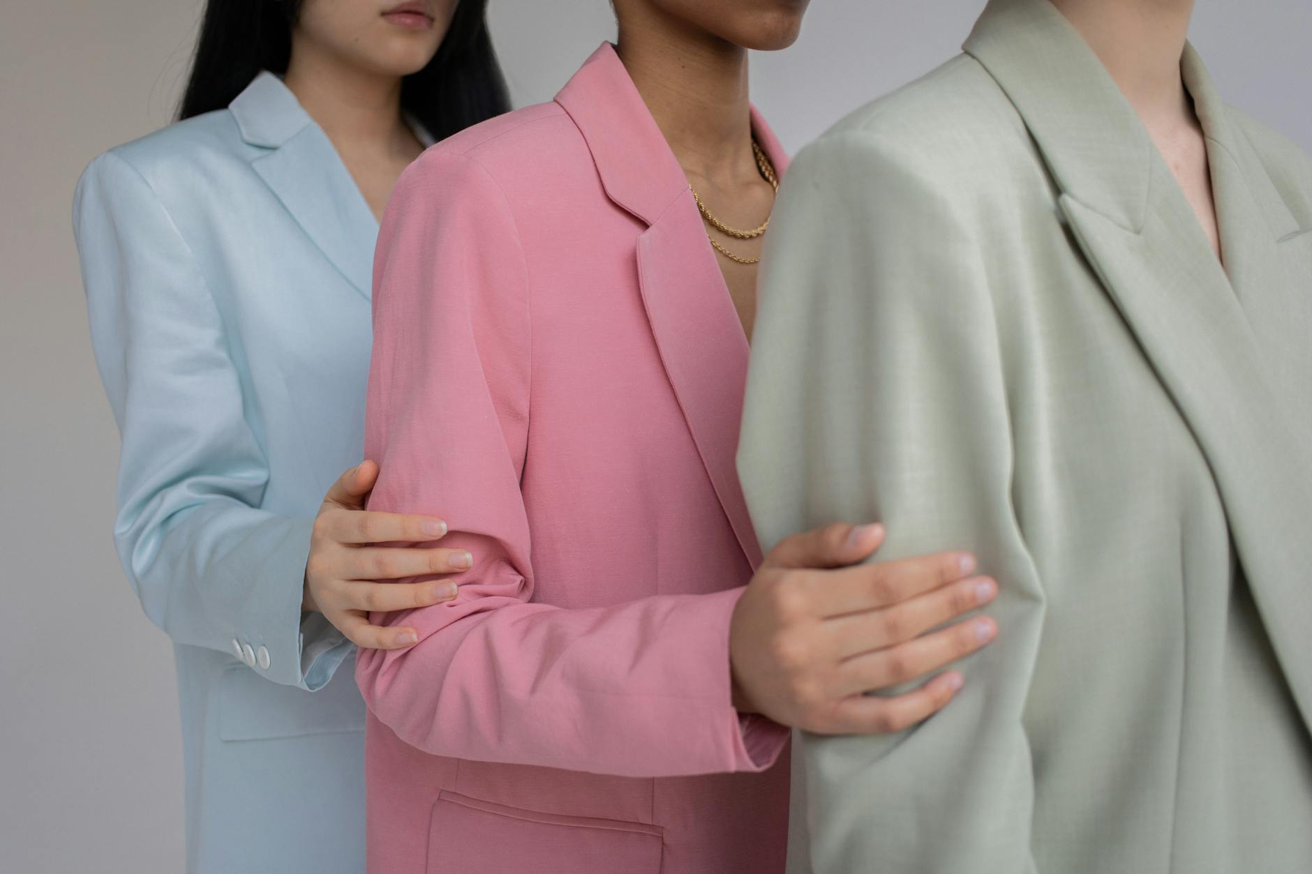
The first is temperature. This is whether your skin leans warm, cool, or neutral. Warm skin tends to glow in earthy tones, cream, camel, olive, peach, and warm reds. Cool skin looks clearer in crisp whites, navy, charcoal, blue based pinks, and berry shades. Neutral skin can often wear both, but will still have favourites.
The second quality is depth. This refers to how light or dark your colouring is overall. Lighter colouring often looks best in softer, lighter tones. Deeper colouring usually suits richer, darker shades.
The third is contrast. This is the difference between your hair, eyes, and skin. High contrast means you can handle bold colour combinations and strong shades. Low to medium contrast tends to shine in softer blends and muted tones.

How to Identify Your Undertone at Home
Forget the wrist vein test. It is unreliable. The better test is fabric.
Hold different colours up to your face in natural light. Try cream versus pure white, camel versus grey, warm coral versus cool pink. Notice which shades make your skin look clearer and which ones create shadows or redness.
Your best colours will make your eyes pop and your skin look even. The wrong ones will draw attention to flaws.
Find Your Undertone in 60 Seconds
Grab a mirror, stand near a window, and answer these with a simple yes or no.
- Do your veins look more blue or purple than green in natural light?
- Does silver jewellery usually look better on you than gold?
- Do you burn easily in the sun rather than tanning deeply?
- Do icy colours like crisp white, cool pink, or blue based red make your skin look clearer?
- Do yellow based beiges, camel, and mustard tend to make you look tired?
- Do you feel your skin has a pink or rosy cast rather than golden?
Mostly yes answers suggest cool undertones.
Mostly no answers suggest warm undertones.
A fairly even mix usually points to neutral undertones.
Understanding Depth and Contrast
Stand in front of a mirror and squint slightly. Do your features blur together or do they stand out clearly. If everything looks similar, you have low contrast. If your eyes, hair, and skin clearly separate, you have higher contrast.
Low contrast wardrobes look best when colours blend softly. High contrast wardrobes can play with stronger differences without looking harsh.
Building Your Personal Colour Palette
Once you know your undertone, depth, and contrast, build a palette of about twelve core colours. These should include neutrals for everyday wear and a handful of accent shades for personality.
Your neutrals might include soft white, taupe, navy, or charcoal depending on your colouring. Your accents could be muted rose, sage, warm rust, or cool berry.
This palette becomes your filter. If something does not fit, you leave it.
Using Colour to Look Expensive
Luxury wardrobes are rarely loud. They use colour with restraint. When your palette is consistent, outfits look cohesive without effort.
Stick to two or three colours per outfit. Keep your base neutral and add one accent. This simplicity is what makes wardrobes feel curated rather than cluttered.
Applying Colour to Hair, Makeup, and Accessories
Your best colours are not just for clothes. They should guide your makeup shades, jewellery metals, and even hair colour.
If gold lights you up, silver will likely dull you. If warm peach blush looks natural, icy pink probably will not. Everything works better when it lives in the same family.
Editing Your Wardrobe
Take everything out and sort into three piles. Looks great, maybe, never wear. The never wear pile is usually full of colours that fight your skin.
This is not about throwing everything away. It is about seeing patterns. Once you know your best colours, you will stop making the same mistakes.
Shopping With Confidence
When you know your palette, shopping becomes calm. You stop browsing randomly and start scanning for colours that belong to you. Impulse buys fade. Regret disappears.
Best Colours for Cool Undertones
If your skin has blue or pink tones and silver jewellery looks better on you than gold, you likely have cool undertones. Your best colours are clean, calm, and slightly blue based rather than yellow based. Think soft navy instead of black, powder blue instead of turquoise, and berry instead of coral. Greys should lean blue or charcoal rather than mushroom or beige. Whites look best when they are crisp and clean rather than creamy. These colours sharpen your features and give your skin a clear, fresh look.
Best Colours for Warm Undertones
Warm undertones have a golden, peach, or olive glow and usually shine in gold jewellery. Your wardrobe should echo that warmth. Choose camel over grey, cream over white, olive over emerald, and soft terracotta over bright red. Warm navy, often called ink or midnight, works better than icy dark blue. These colours blend with your skin rather than fighting it, giving you a naturally healthy, rested appearance.
Best Colours for Neutral Undertones
If you look good in both silver and gold, and your veins appear blue green, you probably sit in the neutral category. This is the most flexible palette, but it still benefits from balance. Soft navy, stone, blush, eucalyptus green, and muted berry are all safe choices. Avoid extremes like very icy pastels or very yellow browns. When colours are slightly softened rather than bold or murky, your complexion looks smooth and even.
Best Colours if You Have Low Contrast
Low contrast means your hair, skin, and eyes are close in depth, for example light brown hair, fair to light skin, and soft eyes. High impact colours can overwhelm you. The key is harmony. Choose gentle blends like pale blue, sage, soft denim, light grey, and dusty rose. Prints should be subtle rather than sharp. When everything in your outfit flows softly together, your natural colouring becomes the focus instead of the clothes.
Best Colours if You Have High Contrast
High contrast people have a clear difference between hair, skin, and eyes, such as dark hair with fair skin or very bright eyes. You come alive in stronger combinations. Crisp white with navy, black with jewel tones, cobalt, emerald, deep berry, and clear red all work beautifully. Avoid muddied or faded shades as they make you look flat. The clearer and more defined the colour, the more powerful and polished you appear.
Frequently Asked Questions
Can I wear black if it is not in my colour palette?
You can, but it is usually better to swap pure black for a softer alternative that suits your colouring. Try soft navy, charcoal, deep taupe, or espresso brown. These shades still feel classic but are far more flattering for most people.
Why do some colours make me look tired or washed out?
Colours that clash with your undertone or overwhelm your natural contrast reflect unflattering light onto your face. This can emphasise shadows, redness, or dullness in your skin. When your colours are right, your skin looks clearer and your eyes appear brighter without makeup.
Are seasonal colour systems still relevant?
They are useful as a starting point, but they are not the full story. Many people sit between seasons or need a customised palette. Focus more on how colours behave on your skin rather than fitting yourself neatly into a box.
How can I test colours at home without a professional analysis?
Use a mirror near a window and hold fabrics, clothing, or even towels up to your face. Compare cool vs warm versions of the same colour, for example icy blue vs soft teal, silver vs gold, cream vs optic white. The right shades will make your complexion look even and healthy straight away.
What is the difference between warm, cool, and neutral undertones?
Warm undertones have yellow, peach, or golden tones. Cool undertones lean pink, red, or blue. Neutral undertones are a blend of both and often suit a wider range of colours, as long as they avoid extremes.
Do my best colours change as I get older?
Your undertone stays the same, but hair colour, skin texture, and contrast levels can shift. Many people find they suit slightly softer or lighter versions of their original palette as they age, especially around the face.
Can makeup and hair colour change my colour palette?
They can influence it, but they do not change your natural undertone. A new hair colour might mean adjusting your best clothing shades slightly, but your core palette will still follow the same warm, cool, or neutral rules.
What are the easiest wardrobe colours that suit almost everyone?
Soft navy, mid grey, gentle white or ivory, dusty blue, muted teal, and soft berry tones tend to flatter a wide range of undertones and contrast levels. These are great building blocks if you are unsure where to start.
Why does white look different on different people?
There is no single perfect white. Cool undertones shine in crisp optic white, warm undertones look better in cream or ivory, and neutral undertones usually suit soft white best. The right white makes your skin look smooth and luminous instead of sallow or grey. See our guide to wearing white here.

How to Build Outfits Using Your Best Colours
Knowing your best colours is only useful if you actually wear them, so this is where everything starts to come together. Instead of thinking about colour as something you pick item by item, start thinking in outfits and groups.
Begin with your core neutrals. These are the shades you will wear most days and build everything else around. If you are cool toned, this might be soft navy, charcoal, and cool grey. Warm undertones usually look better in camel, warm taupe, and soft chocolate brown. Neutrals should make up at least half of your wardrobe because they form the base for work outfits, travel looks, and everyday dressing.
Next, choose three to five signature colours from your best palette. These are not loud statement colours, but reliable shades that you genuinely enjoy wearing. Think muted teal, dusty rose, sage, berry, soft blue, or olive depending on your undertone and contrast. When you are shopping, look for these colours first. This simple habit alone will stop your wardrobe from drifting off track.
Now apply the three colour rule when creating outfits. Every outfit should have no more than three main colours, including neutrals. For example, soft navy trousers, a pale blue shirt, and a berry knit is three colours and always looks intentional. This rule makes even casual outfits feel considered without needing any effort.
Pay special attention to the colour nearest your face. Tops, scarves, jackets, and dresses in your best shades will always make the biggest difference to how you look. If you love a colour that is not in your palette, keep it away from your face, for example as shoes, bags, or trousers.
When you are buying prints, check the background colour first. If the base shade is right for your undertone, the print will almost always work. If the background clashes with your colouring, no amount of pattern will save it. This one check will prevent most impulse buys that never get worn.
It also helps to group your wardrobe by colour at home. Instead of organising only by type, try arranging by shade within each section. You will start to notice patterns very quickly, which colours dominate, which ones are missing, and which ones you never wear. This makes it much easier to see gaps in your wardrobe and shop with purpose.
Finally, remember that colour confidence builds with repetition. The more you wear your best shades, the more comfortable you feel in them, and the less tempted you will be by colours that never quite work. Over time, your wardrobe becomes lighter, easier to mix, and far more reflective of who you actually are rather than what happened to be trending when you bought it.
Your Next Step
Now that you understand undertones, contrast, and how colour really works on your skin, it is time to put it into practice. Tonight, stand in front of a mirror in natural light and test a few of your clothes using the tips in this guide. You will be surprised how quickly the right shades make you look fresher and more put together.
Once you have identified your best colours, the easiest way to lock them into your everyday style is to build a wardrobe around them. Our capsule wardrobe guide shows you exactly how to turn your colour palette into outfits that work together effortlessly, so you stop buying clothes that never get worn and start wearing everything you own with confidence.
Finding your best colours is not about rules. It is about alignment. You feel more confident, you waste less money, and your clothes finally start working for you rather than against you.
Want more? See our Grown-Up Guide to Dressing For Your Body Type.


Leave a comment